阿涅斯·瓦尔达海报
Agnès Varda posters
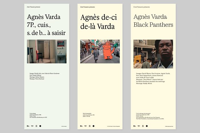
每部片独立字体,保留原片比例剧照,按类型分底色。
旧版存档 · 2026-10-02 · 旧版评分 72/100
工艺一句
每部片独立字体,保留原片比例剧照,按类型分底色。
观察
三张25×70cm竖长海报并排,上端统一米白底与深色小字,中段为比例各异的原片剧照,下方密集排布演职员名单。片名分别使用衬线、无衬线、粗黑等差异字体,长宽比与画面一致,无裁切。
设计逻辑
项目为瑞典发行商NonStop Entertainment收购瓦尔达全部39部影片的放映与节目设计海报,要求每部片独立字体、剧照保留原比例并按类型色彩编码。窄长开本与统一上端使系列成立,而中段剧照与片名字体的差异承担单片识别。
可借鉴的做法
可迁移动作:用统一窄长开本与顶部信息区建系列,将唯一变量留给片名字体与剧照比例;先按内容类型定底色,再为每部片选一种字体,不叠加其他装饰。
来源摘要
Contributed by Stefania Malmsten Malmsten Hellberg . License: All Rights Reserved . Andersen Regular; Helvetius Regular; Cardone Light Agnès Varda (1928–2019) was a completely unique director, blending genres, styles and techniques across different themes. Swedish quality film distributor NonStop Entertainment recently acquired the entire Varda catalogue for the Nordic countries. Malmsten Hellberg were commissioned to design posters for each of the 39 films for screenings and programmes. The image of each poster is a carefully selected still that retains the ratio from the original film and the smallish (25×70cm) posters are colour coded after genre. Each film title has its own typeface from
本站只整理摘要与原文入口,完整内容与图片请阅读原文。
来源:Fonts In Use · fontsinuse.com