Apichatpong Weerasethakul – Periphery of the Night 展览海报
Apichatpong Weerasethakul – Periphery of the Night exhibition poster
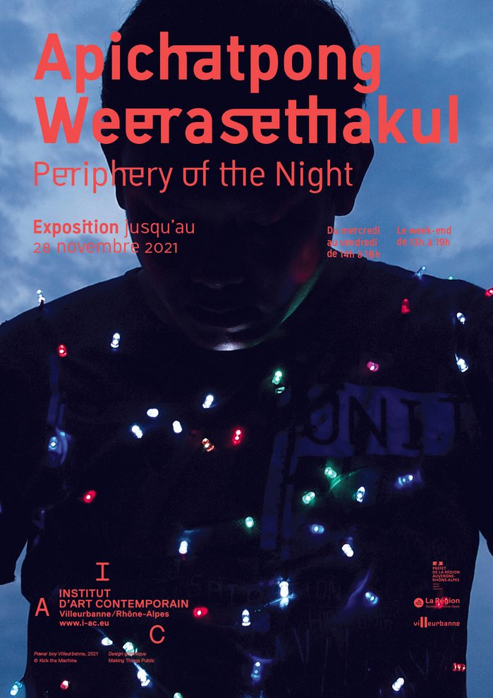
采用窄体红字压深蓝暗底,标题叠在人物剪影与灯串之上。
旧版存档 · 2026-10-06 · 旧版评分 75/100
工艺一句
采用窄体红字压深蓝暗底,标题叠在人物剪影与灯串之上。
观察
画面由深蓝至黑的暗调人物剪影铺满,红橙色标题大字压在人物面部与胸口位置。人物身上散布彩色小灯串与白色点状高光,标题字重与间距均偏紧,呈窄体结构。左中右三处小字排版沿人物轮廓边缘分布,形成错落的信息层。字体本身带有因泰文动态结构而生的连字变形,部分字母有横向连接或切割。
设计逻辑
标题为展览名与艺术家名,摘要说明选用 Machine GK 早期窄体版本以应对长名字,并借鉴泰文字母动态制作连字以呼应文化融合。因此,大字不仅是信息,也被赋予泰国文字的视觉节奏。海报借用当代艺术展览的常规版式,同时用灯串与暗夜把视线导向作品氛围。
可借鉴的做法
迁移时先为超长人名或题目选一套窄体结构字,再把标题直接叠在深色图像的上方做字形与画面融合。可在正文小字里做沿人物轮廓的错落排布,并在字体设计上对少数拉丁字母加连接或切割,让字形本身承载文化符号,而非仅用图形补丁。
来源摘要
Contributed by Begel jeremy Source: www.makingthingspublic.com License: All Rights Reserved . For the promotional materials for Apichatpong Weerasethakul ’s 2021 exhibition Periphery of the Night at the IAC (Institut d'art contemporain) in Villeurbanne/Rhône-Alpes, the title is typeset in Machine GK , using one of the earliest cuts of the typeface. First, given the length of the name, we needed a condensed typeface that would take up less space than a standard typeface. Second, drawing inspiration from the Thai alphabet and its unique dynamics, a set of ligatures that alter the design of the Latin letters was created to evoke this cultural fusion. The poster adopts the conventions of contemp
本站只整理摘要与原文入口,完整内容与图片请阅读原文。
来源:Fonts In Use · fontsinuse.com