Saboteur
Saboteur
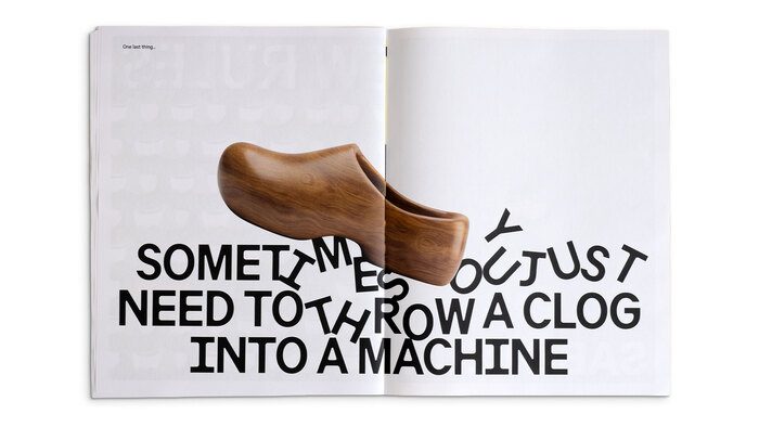
让实物压在跨页标题上并遮住笔画,字与物的遮挡关系成为画面机制。
旧版存档 · 2026-09-28 · 旧版评分 73/100
工艺一句
让实物压在跨页标题上并遮住笔画,字与物的遮挡关系成为画面机制。
观察
画面是一本摊开的跨页:右页近纯白,左页铺满一层浅灰的重复字形底纹,左上角有一行小字「One last thing.」。一只木质屐鞋斜放在中缝附近,鞋身横压在下半页的通栏黑色粗体标题上,被遮住的字母只剩断裂的局部笔画。标题三行、字距紧、行距密,几乎占满页宽,黑字与灰纹、白底构成清晰的两级灰度。
设计逻辑
标题自己说出了方法:把一只木屐丢进机器里。图像照着这句话做——把实物丢进排版里,让文字被物理打断,句子既是被读的,也是被砸过的。摘要说明这是一家品牌工作室用自己的品牌识别来展示 F37 Analog,字体带古怪细节,与大胆图形系统和俏皮艺术指导并置,正好承接这种不讲道理的动作。
可借鉴的做法
做跨页或封面标题时,先定一句粗体通栏文案并排满页宽,再选一件与句子语义相扣的实物摄影压过其中一行,让遮挡处的残字成为新图形。另可把同一字体放大做浅灰重复底纹,让黑标题在读与看之间多出一层灰阶,制作上只需一色加一底色即可复现。
来源摘要
Contributed by F37® Source: www.saboteur.studio Saboteur . License: All Rights Reserved . Branding studio Saboteur uses F37 Analog throughout its own brand identity, bringing a distinctive, characterful voice to the studio’s visual language. Paired with a bold graphic system and playful art direction, the typeface helps create an identity that feels confident and expressive. Source: www.saboteur.studio Saboteur . License: All Rights Reserved . Source: www.saboteur.studio Saboteur . License: All Rights Reserved . Source: www.saboteur.studio Saboteur . License: All Rights Reserved . Source: www.saboteur.studio Saboteur . License: All Rights Reserved . Source: www.saboteur.studio Saboteur . Lic
本站只整理摘要与原文入口,完整内容与图片请阅读原文。
来源:Fonts In Use · fontsinuse.com