Mimos 创意花艺工作室品牌
Mimos
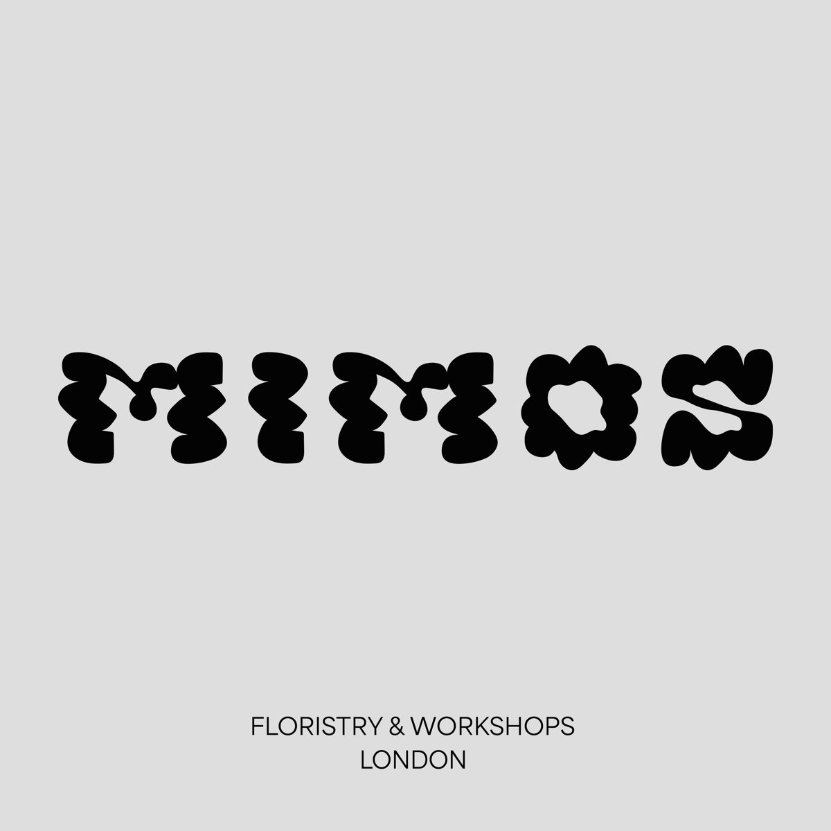
把字母写成含羞草花瓣的形状,字即花,花即字。
旧版存档 · 2026-09-29 · 旧版评分 72/100
工艺一句
把字母写成含羞草花瓣的形状,字即花,花即字。
观察
画面极简,浅灰底上只有一行黑色定制字,字形被故意扭曲成花瓣与花蕊的轮廓,笔画间的负空间形成花心空洞,字母几乎不可辨读。底部一行无衬线小字 FLORISTRY & WORKSHOPS / LONDON 做说明,字距克制,与上方夸张字形形成强烈尺度反差。
设计逻辑
标题与摘要指向伦敦东区一家结合花艺与陶艺工作坊的创意空间,logo 的玩趣字形直接取自含羞草花的形态,笔画曲线呼应花朵娇柔又鲜活的质感,摘要提到的 Area 与 Area Inktrap 字体则用于承载这套活泼、梦幻的识别系统。
可借鉴的做法
可迁移动作:把品牌名逐字改造成与品类物象同构的图形,让字形本身承担插画功能,不再另加图标;用中性底与极简说明字守住画面秩序,把全部表现力押在那一行字上。
来源摘要
Contributed by superpoint Superpoint . License: All Rights Reserved . Art direction, branding and custom lettering for creative hub Mimos . Nestled in the vibrant streets of East London, Mimos offers a unique experience, blending the beauty of flowers with the art of ceramics through its innovative workshops. The logo, crafted with playful lettering, draws inspiration directly from the mimosa flower. Each stroke and curve reflects the delicate yet vibrant essence of this vivid bloom, creating a visual identity that is both fun and dreamy, reinforced by the lively colour palette. Typography plays a key role in the identity, pairing Area and Area Inktrap by Blaze Type . Their bold, playful cha
本站只整理摘要与原文入口,完整内容与图片请阅读原文。
来源:Fonts In Use · fontsinuse.com