Bright 作品集网站
Bright portfolio website
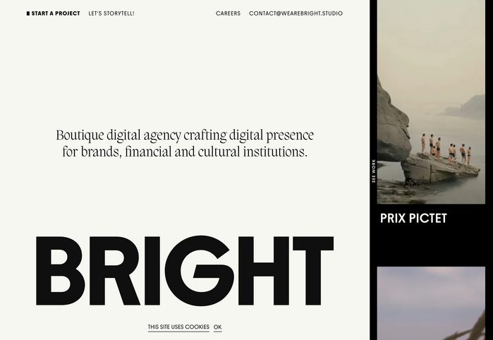
以超大字号站名压底,衬线文案居中留白,右侧竖排图注与主图形成窄栏对照。
旧版存档 · 2026-10-06 · 旧版评分 72/100
工艺一句
以超大字号站名压底,衬线文案居中留白,右侧竖排图注与主图形成窄栏对照。
观察
画面左侧大面积米白留白,中央是衬线体的短句自我介绍,底部被巨大无衬线黑字 BRIGHT 截断。右侧一条窄栏纵向排列小图、竖排贴纸文字和 PICTET 标题,形成大小字与图文强对比。
设计逻辑
标题与摘要说明这是 Bright 数字设计工作室的作品集网站改版,设计目标是把品牌蒸馏到核心:无缝交互和强烈的字体存在感。因此画面用极简留白和超大字号建立识别,右侧窄栏暗示滚动浏览的作品片段。
可借鉴的做法
做品牌作品集首页时,可以把品牌名放大到接近满宽、压住版心底线,同时在其上方留出大片安静空间承载一句定位文案;再用一条窄侧栏叠放项目缩略图和竖排字样,营造翻阅感。
来源摘要
Contributed by Maciej Rodzik Source: www.wearebright.studio License: All Rights Reserved . Bright is a digital design studio based in Warsaw, Poland. My redesign of their portfolio website is centered around a visual language inspired by distilling the brand to its core: seamless interactions and bold typographic presence. Source: www.wearebright.studio License: All Rights Reserved . Source: www.wearebright.studio License: All Rights Reserved . Source: www.wearebright.studio License: All Rights Reserved . Source: www.wearebright.studio License: All Rights Reserved . Source: www.wearebright.studio License: All Rights Reserved . Source: www.wearebright.studio License: All Rights Reserved . Sou
本站只整理摘要与原文入口,完整内容与图片请阅读原文。
来源:Fonts In Use · fontsinuse.com