Yeubo 儿童维生素品牌
Yeubo
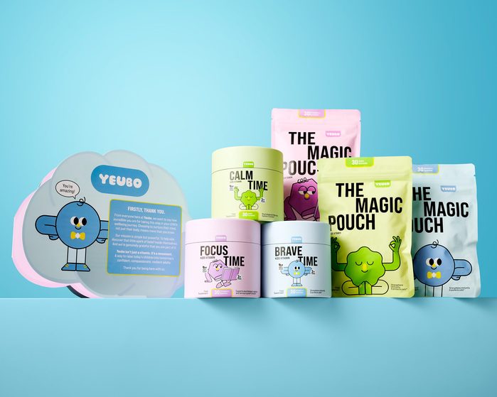
马卡龙色容器错落成组,每罐配几何脸角色与粗黑标题字。
旧版存档 · 2026-10-02 · 旧版评分 72/100
工艺一句
马卡龙色容器错落成组,每罐配几何脸角色与粗黑标题字。
观察
浅蓝渐变背景上,五只罐子和一个异形袋沿一条水平线前后错落排列。罐体分别为浅黄、浅粉、浅蓝、浅绿、白色,各配一个圆润几何形状的卡通角色,角色表情和姿态不同。文字用粗黑无衬线大写英文主导,产品名最大,成分或口味小字压在下部。左侧异形袋用大块浅灰蓝和浅粉作底,内嵌浅蓝圆角标签区,上写YEUBO,与右侧罐群形成字图节奏对比。
设计逻辑
项目目标是让家长放心、孩子喜欢,并避开儿童维生素品类里橘色和授权角色的常规做法。代表图用马卡龙色与原创几何角色替代橘色和现成IP,同时把罐装做成可收藏、可展示的玩具感物件,把营养品从药店货架的药品感转向儿童可亲近的日常用品。
可借鉴的做法
当品类被单一颜色和现成角色占满时,可以反向选择低饱和、多色并置的容器系统,再为每个SKU设计一个姿态和表情有差异的几何角色。品牌字标可以退到小圆角标签里,主视觉让位给角色和产品名的大字排版,形成可延展的货架阵列。
来源摘要
Contributed by Noramble Source: noramble.co.uk License: All Rights Reserved . Yeubo is a new British children’s vitamin supplement brand, founded by influencer Emilio Koumis . Emillio required a brand that appealed to parents from a commercial perspective while exciting the child as the end user. UK children’s vitamins are dominated by orange as both a colour and flavour cue, and by licensed-character tie-ins. The category also defaults to standard pharmacy-shelf plastic bottles, positioning vitamins as medicine to be tolerated rather than something a child looks forward to. We moved away from both the orange palette and borrowed licensed characters, building original product mascots and a p
本站只整理摘要与原文入口,完整内容与图片请阅读原文。
来源:Fonts In Use · fontsinuse.com