《Bibliothèque(s)》第105期「文化权利」
Bibliothèque(s) no. 105, “Droits culturels”
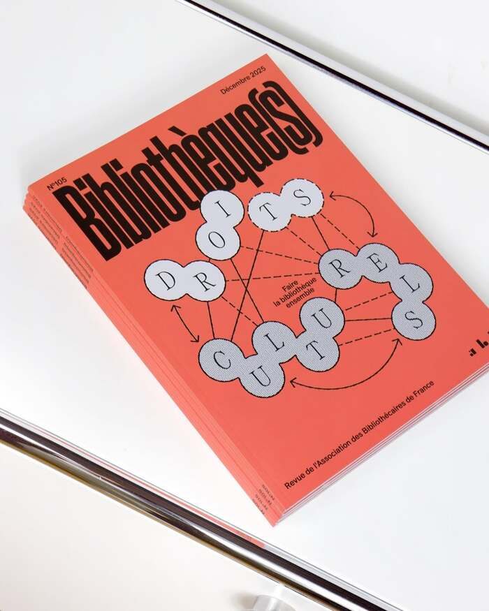
黑体刊名压满上半版,银色圆点字块用实线与弧线连成网络图,专色底上只放两种灰。
旧版存档 · 2026-10-07 · 旧版评分 72/100
工艺一句
黑体刊名压满上半版,银色圆点字块用实线与弧线连成网络图,专色底上只放两种灰。
观察
代表图是斜放的一叠期刊封面,橘红色满版铺底。刊名 Bibliothèque(s) 以极重的黑体斜排,从左上角压到版面中部,字号远超常规刊头。下半版把 DROITS CULTURELS 拆成银灰圆点字块,用细直线、虚线、弧线与箭头连成关系网络,中心插入一小段法文说明。字块带网点质感,与纯色底形成材质反差,整版只有黑、银灰、橘红三色。
设计逻辑
标题指向文化权利与图书馆的日常实践,摘要说明该期汇集访谈、参考与案例,讨论包容、公众参与和文化多样性。把主题词拆成节点并连成网,正是把「权利的实施靠多方连接」这一抽象议题转成可直接读的图;圆点字块既像数据节点,也像被公共讨论串联起来的读者。字体由 Extraset 与 Hard Type Foundry 提供,工具本身也参与叙事。
可借鉴的做法
可迁移的动作有两点:一是让刊名或主标题以超大字号越出常规位置,靠重量和斜度占据上半版,把下半版让给信息图;二是把核心关键词拆成单元块,用连线与箭头组成可见的关系结构,再配一个专色底和一到两种材质灰,避免多色干扰。
来源摘要
Contributed by Extraset Type Foundry Source: www.instagram.com License: All Rights Reserved . The 105th issue of Bibliothèque(s) is dedicated to cultural rights and the role of libraries in putting them into practice on a daily basis. The central feature brings together interviews, key references and case studies from France and abroad, exploring topics such as inclusion, public participation and cultural diversity, alongside reflections on the profession, legislation, management and bibliotourism. Designed by Studio des formes , the publication uses Nein and ES Allianz by Extraset alongside HD Microbic by Hard Type Foundry throughout the issue. Source: www.instagram.com License: All Rights
本站只整理摘要与原文入口,完整内容与图片请阅读原文。
来源:Fonts In Use · fontsinuse.com