Fonts In Use 记录 Footnotes 第 F 期:每篇文章以相关字体排版
Footnotes, issue F
La Police 出版的双年刊 Footnotes 第六期即 F 期收录四篇文章,每篇都用与文章相关的字体排版,其中部分字体仍在开发、尚未发布。内容包括 Sophie Wietlisbach 从法医学视角写瑞士打字机字体、六位受邀者各挑四张唱片封面作排印角度分析、Adrien Vasquez 记录的威尼斯街头模板字,以及 Olivier Lebrun 的第四篇。
旧版存档 · 2026-10-08 · 旧版评分 34/100
工艺一句
黑底满版出血加黑白叠层照片,字号极小,压住图片下缘。
观察
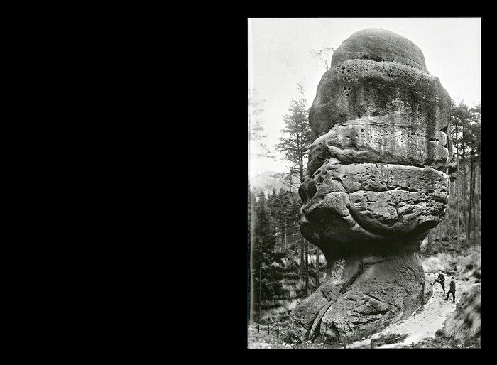
封面以大面纯黑铺底,右侧嵌入一块黑白照片,风化巨石占据主体,石面上叠加极细小的模糊字形,近看像涂写或风化痕迹。左下角仅露出一小段文字痕迹,字图关系是图为主、字退到石面纹理里。整体单色、低反差、无彩色辅助。
设计逻辑
这是 La Police 出版的字体设计年刊第六期封面。摘要说明内容围绕打字机字体、瑞士语境和六位受邀者各选四张封面进行排版视角的写作。黑色大面积与单图并置的克制处理,让封面像一份静默的档案或证据照片,呼应“forensic science”与“记录”的编辑意图。
可借鉴的做法
可以迁移的动作:选一张本身信息密度高的黑白纪实照片,只保留一个矩形图区和大面积黑底,把标题或符号以极小、极细的方式嵌进照片纹理中,让字成为图像的一部分而非独立版面元素。
来源摘要
Contributed by Mathieu Christe Photo: Mathieu Christe . La Police . License: All Rights Reserved . Footnotes issue F: front cover Footnotes is a type design periodical published biennially by La Police . The sixth issue begins with an article by Sophie Wietlisbach on typewriter typefaces in Switzerland under the lens of forensic science, where the infamous Haas Atlas turns out to be a type specimen. For the second article, entitled “For the records #1”, six people (Francis Baudevin, Selina Bernet , Raffael Dörig , Florian Hardwig , Maud Pollien, Quentin Schmerber ) were invited to pick four covers each, and write about them from a typographic perspective. A series of drawings with extensive
本站只整理摘要与原文入口,完整内容与图片请阅读原文。
来源:Fonts In Use · fontsinuse.com